TruckSite
About TruckSite
TruckSite is an eCommerce platform that sells ex-government-owned commercial trucks and equipment. This website is not only for purchasing trucks but also for receiving exhaustive information on these peculiar products.

Technologies

.NET MVC

Azure

jQuery

Bootstrap

Cloudflare

Salesforce

Business needs
The platform experienced numerous issues due to the use of outdated and irrelevant technologies, including:
- Some browsers stopped supporting certain features
- Some features like sending emails stopped working
- The platform was vulnerable to spam
- The website needed enhanced security
Proceeding from the information given by the website owner, we discovered that most potential customer visits don’t end with a purchase. We analyzed the problems that occurred during the customer visit and decided on such platform improvements:
- Integrate SalesForce system to monitor sales and customer experience
- Redesign the website and create a progressive UI
- Enrich the functionality
- Prolong the user stay on the website
- Add a user-friendly form for financial application
- Optimize the website operation via eliminating errors and warnings
IT Hoot solution
Updating JS Plugins
First of all, we started working on the Frontend as it was an urgent customer need. Many errors and warnings appeared when the users entered the website via browser and we eliminated them by plugin updates.
Redesign
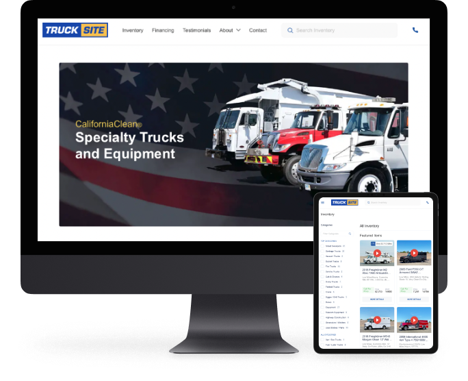
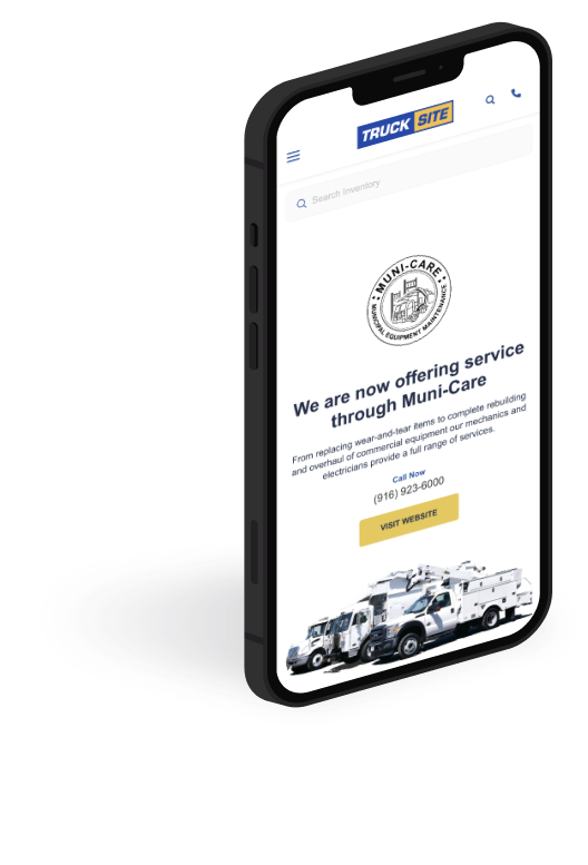
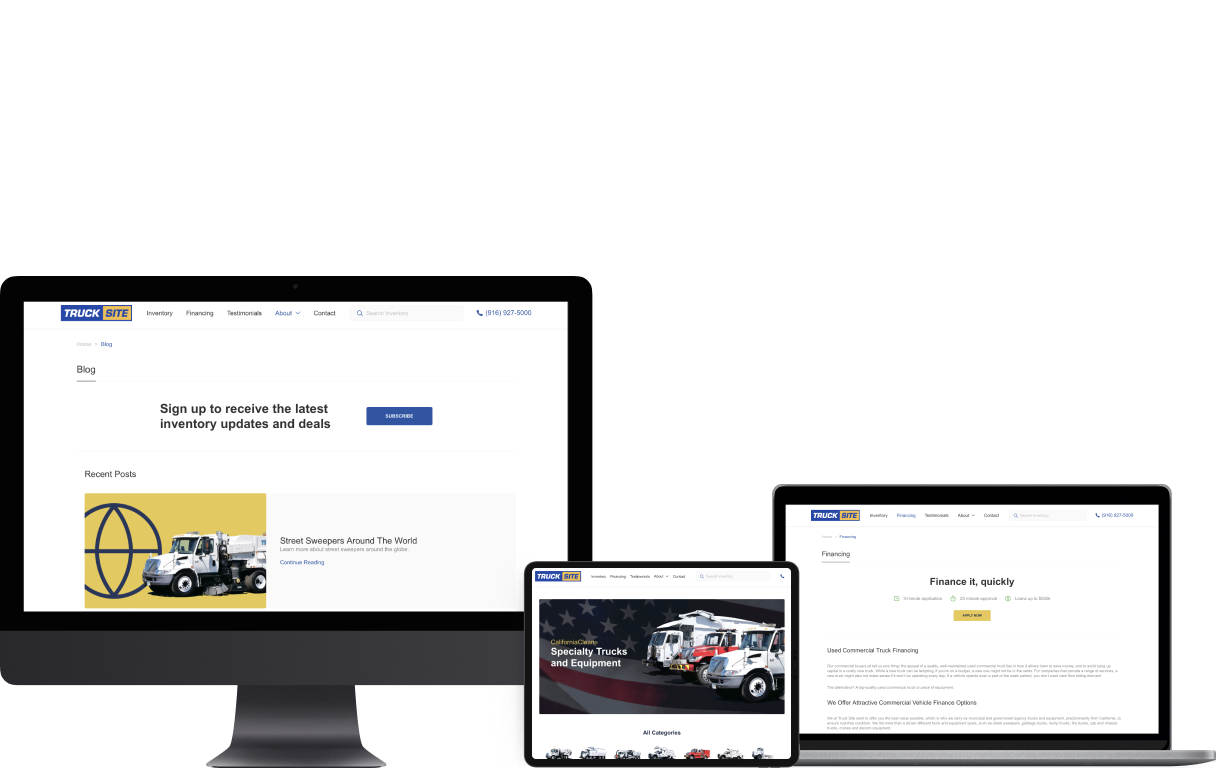
The User Interface was outdated and needed upgrades. We used a completely new mockup, created a new HTML layout, and made the UI/UX design more intuitive and appealing. The new minimalistic and logical design helps customers go through a well-thought user path that ends with contacting a manager.
Inventory page
When the customer goes to the TruckSite, the inventory is the very first thing they see. On this page, we enabled such interactions:
- Viewing the categories and number of trucks available in each one
- Viewing the key product information: manufacturer, mileage, stock, etc
- Sorting the search by year and model
- Search option
Product Page
The product page contains product images and videos. The user can view the images in a full-screen mode, zoom in, download an image or share it via social networks (Facebook, Twitter, Pinterest).
Below, there is an application form for financing and a chart with extensive product characteristics, such as:
- Chassis Information
- Equipment Specifications
- Dimensions
We included numerous abilities to get in touch with the platform managers. A convenient contact form involves only necessary fields and filling the form takes only a few minutes.
Financing option
With the truck being a costly product, the website offers a financing opportunity. This is a significant step towards the customer needs and personalizing the services. That’s why we implemented a convenient form to submit applications for used commercial trucks. Filling it in takes only 3 minutes and the users receive an approval within 20 minutes, which significantly improves the user experience.
Extended Functionality
At the bottom of the product page, the customer can see the recently viewed products and access their pages within one click. This saves time and prolongs the stay on the website. The users can also print product information.
Salesforce system integration
Integrating this CRM system boosts the website’s efficiency. Salesforce offers extensive functionality that helps the eCommerce website owners understand the user needs and adapt to them. It is powered with such features as data collection and analysis, data reports, sales forecasts, and contact management.
Technologies we used
SendGrid API enables automated email generation. The users receive rocket-fast email generation and share the information seamlessly.
Cloudflare API integration enables the fastest information access via connecting to the nearest servers. That’s why users from different US states and other countries can seamlessly interact with the website.
Results
After improving the platform, the owner received a more functional and seamlessly operating website that enabled more effective interaction with customers. A renewed UI/UX helped make the platform more attractive and prolong the user stay. Improvements we made led to an enhanced user experience and as a result, an increase in sales. For an eCommerce product, it is essential to develop a convenient user environment.


Discuss your projects with our specialists
We are a reliable partner for your software development needs. Our priority is a long-term partnership.
Contact us