Top 10 upcoming web design trends for 2023
Visualization of content is one of the crucial elements in a website, particularly in eCommerce. Glassmorphism, gradients, and static 2d pictures, no matter how beautiful they are, became lifeless and ordinary-looking. Hence, there are a few ways how to make the presentation of the product more memorable:
3D Animation
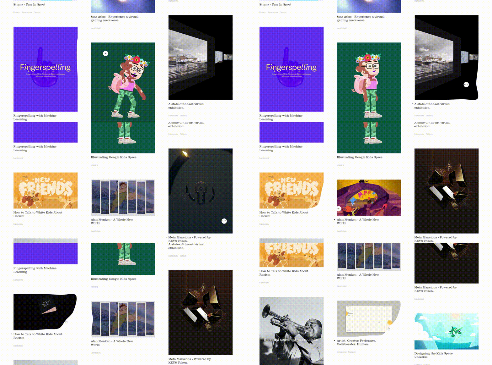
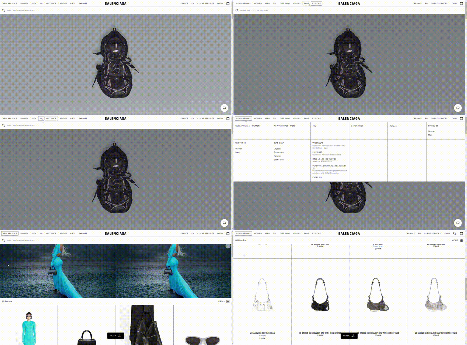
Three-dimensional elements have been used earlier, but 2023 has improved this trend. Now 3D elements are supposed to move according to the user's actions. Interactive 3D visuals will engage users more efficiently and allow them to look over the product in detail from different sides.
XR
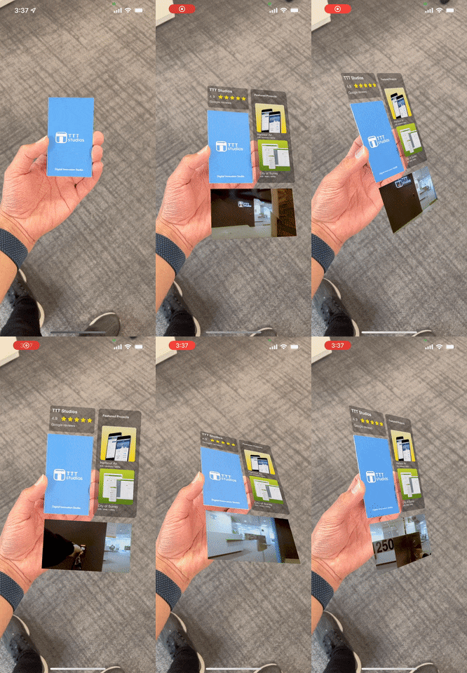
Extended reality is the collective concept that unites Augmented, Virtual and Mixed Reality. These technologies have been used in video games, Instagram filters, car production, and e-learning already. Recently, it has become widely implemented in web development because of its proven effectiveness. Also, Apple's announcement about launching the production of AR glasses facilitated this process. There are even business cards that contain more information thanks to augmented reality.
Immersive experience
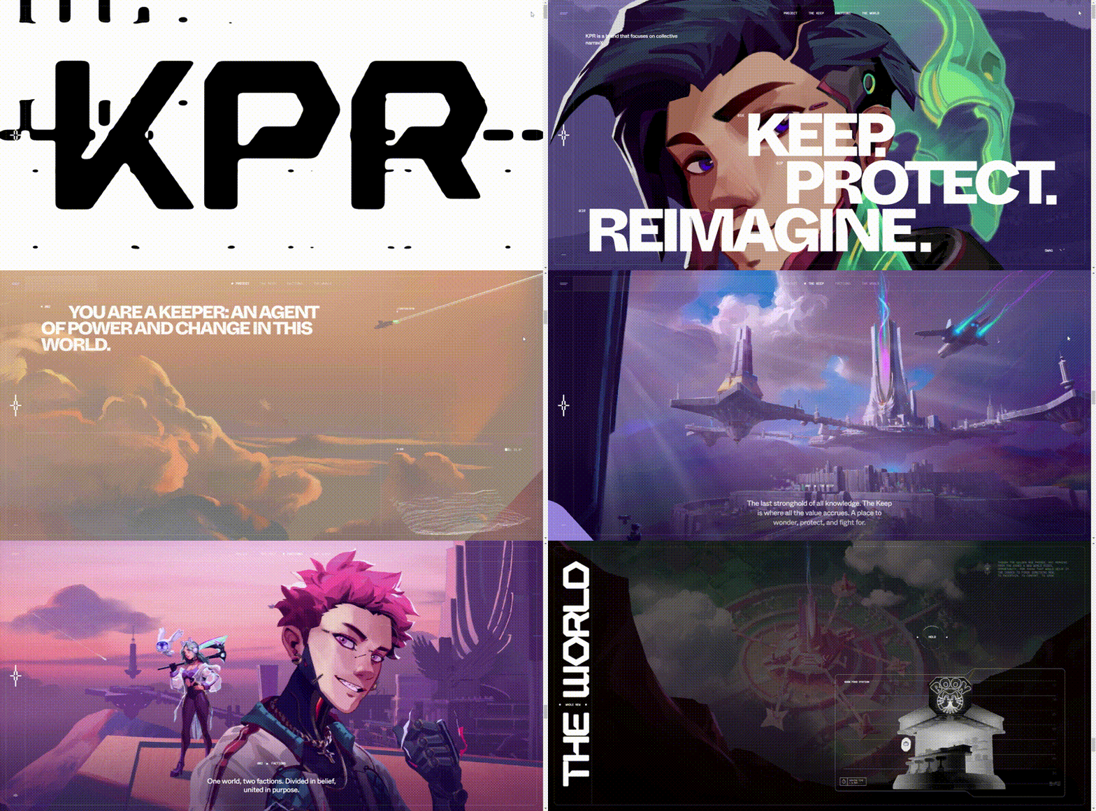
Exceptional user experience and eye-catching visuals are the main aims of web designers. Smooth transitions between blocks, sophisticated animation, and background music create the magical atmosphere everyone wants to stay in longer.
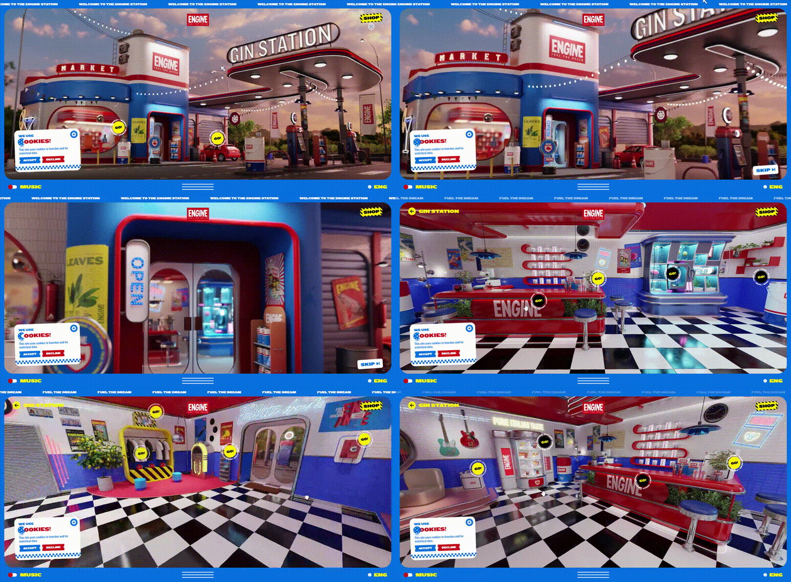
The 3D world as a website map also can provide an immersive user experience. Such a design dramatically prolongs the dwell time (time spent on the website) and drags the user into a new unexplored interactive world.
According to the statistics, 25% of users close the tab if loading takes more than 4 seconds. Therefore, the speed of page loading also needs additional attention and optimization because all these effects are highly traffic-consuming. In addition, sound effects require permission before playing.
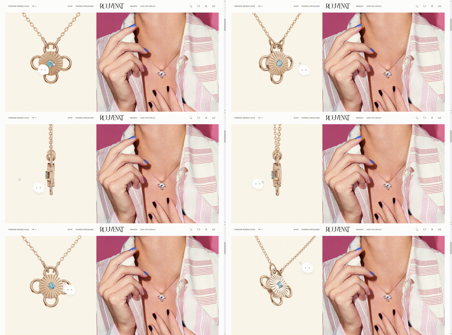
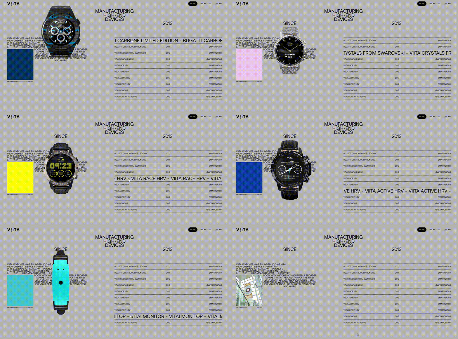
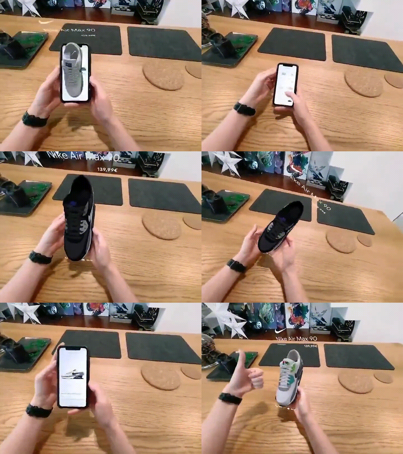
The product reveals a hover effect
It implies the demonstration of the product to the customer without clicking on it, providing speed browsing. Also, this effect shows how to use the product and its other sides or features via interactive animation, which encourages users to browse and look for more reveals.
AI chatbot
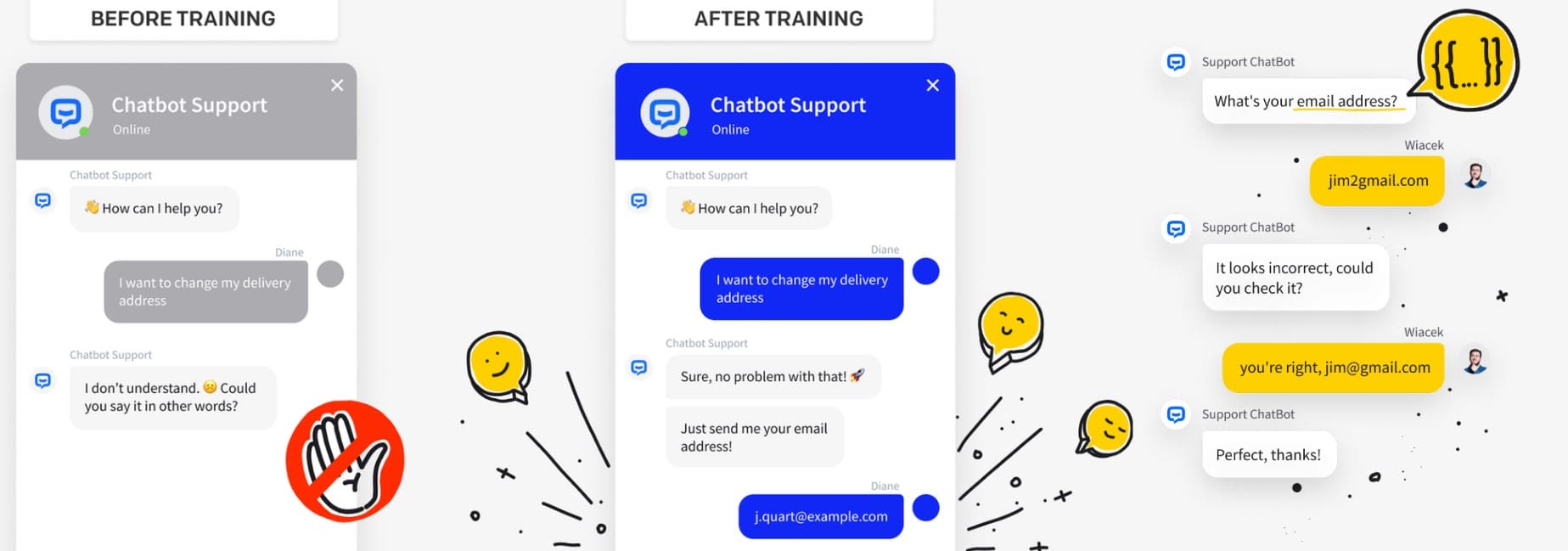
Using Artificial Intelligence in chatbots can solve up to 80% of sent queries, which may dramatically cut support costs. Also, AI learns from previous language patterns and improves the understanding of queries. And the key advantage is higher speed due to faster processing of the text and search directly in the database.
Advanced microinteractions
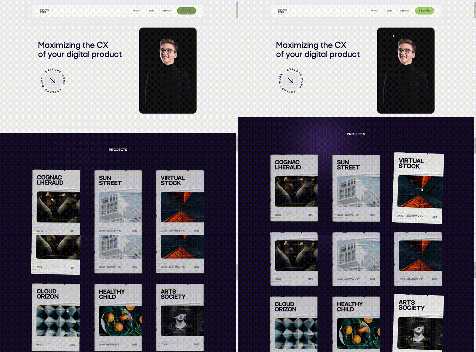
Microinteractions are little animations that give users an understanding of their actions and a sense of control. Also, that is a convenient way to highlight cells and links without an oversaturation of the page. Predictable and good-looking navigation makes visitors stay on the website longer.
Horizontal scrolling
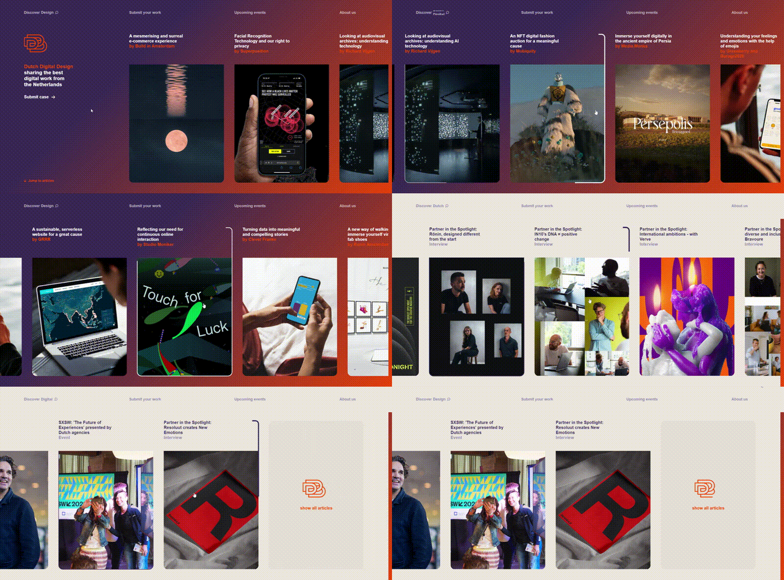
Vertical scrolling remains the most widely spread one, but horizontal burst forth. It feels like book pages flipping and may confuse the users but then get them interested. The convenience of this approach is visible on social media via swiping the pictures. It helps to fit in more information on one screen.
Brutalism
Brutalism united features of new minimalism and the tendency to overstimulation. It refers to the beginning of website development when designers had to fiddle with HTML to add a minimal amount of content to the webpage. Brutalism attracts with its honest and down-to-earth appearance, without unnecessary distractions. On the other hand, someone can consider it a careless and poorly-developed design. It stands out among other websites with its conciseness but scares away by its rawness.
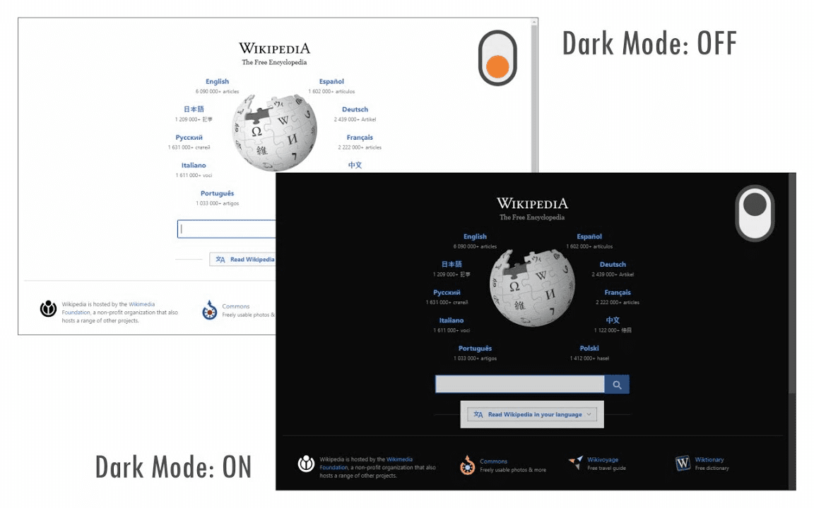
Dark mode
The dark mode used to be a specific feature of mobile applications, but now it is a new web design trend. It is noteworthy not only as a design solution but also as a tool for readability improvement and eye strain reduction at night. Also, darker colors cut the number of blue lights and lessen battery consumption.
Accessibility
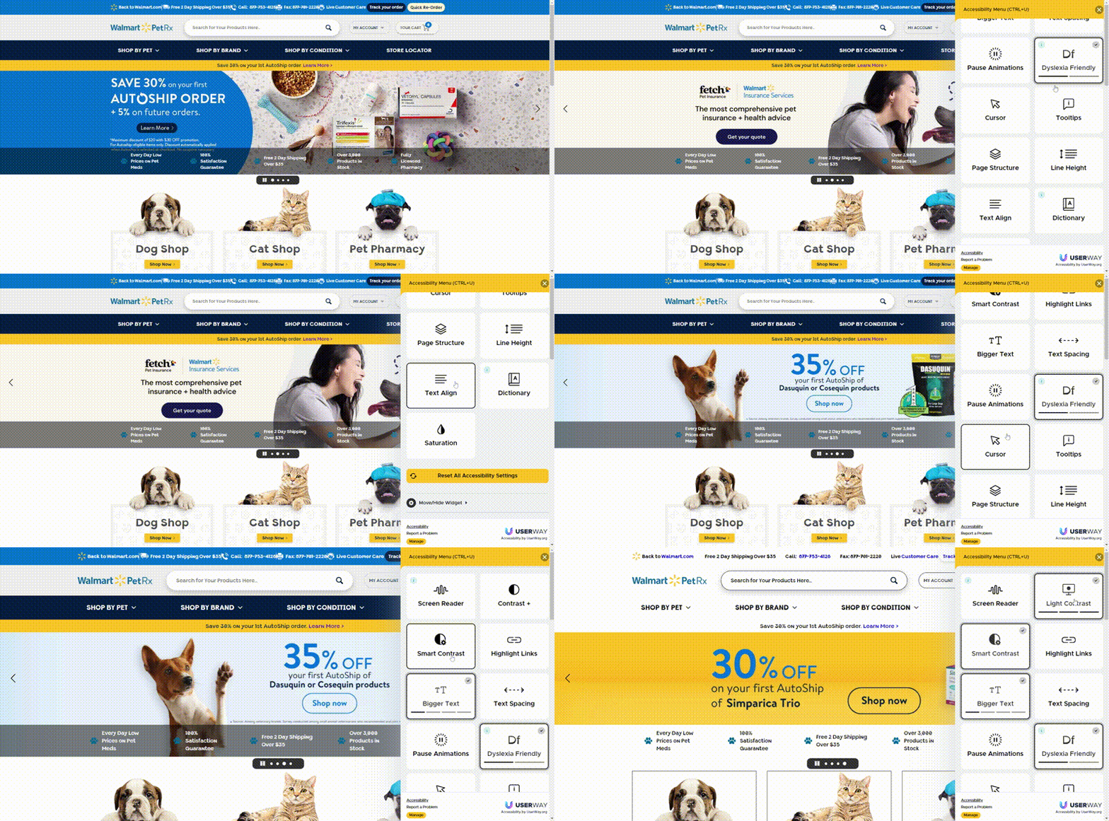
Inclusivity is a new necessity. Brands show their care about customers with disabilities in such a way. Implementation of additional functions and voice assistance takes more time and requires creating a different design for each case to ease the perception of text or pictures and find links.
Sophisticated 404 page
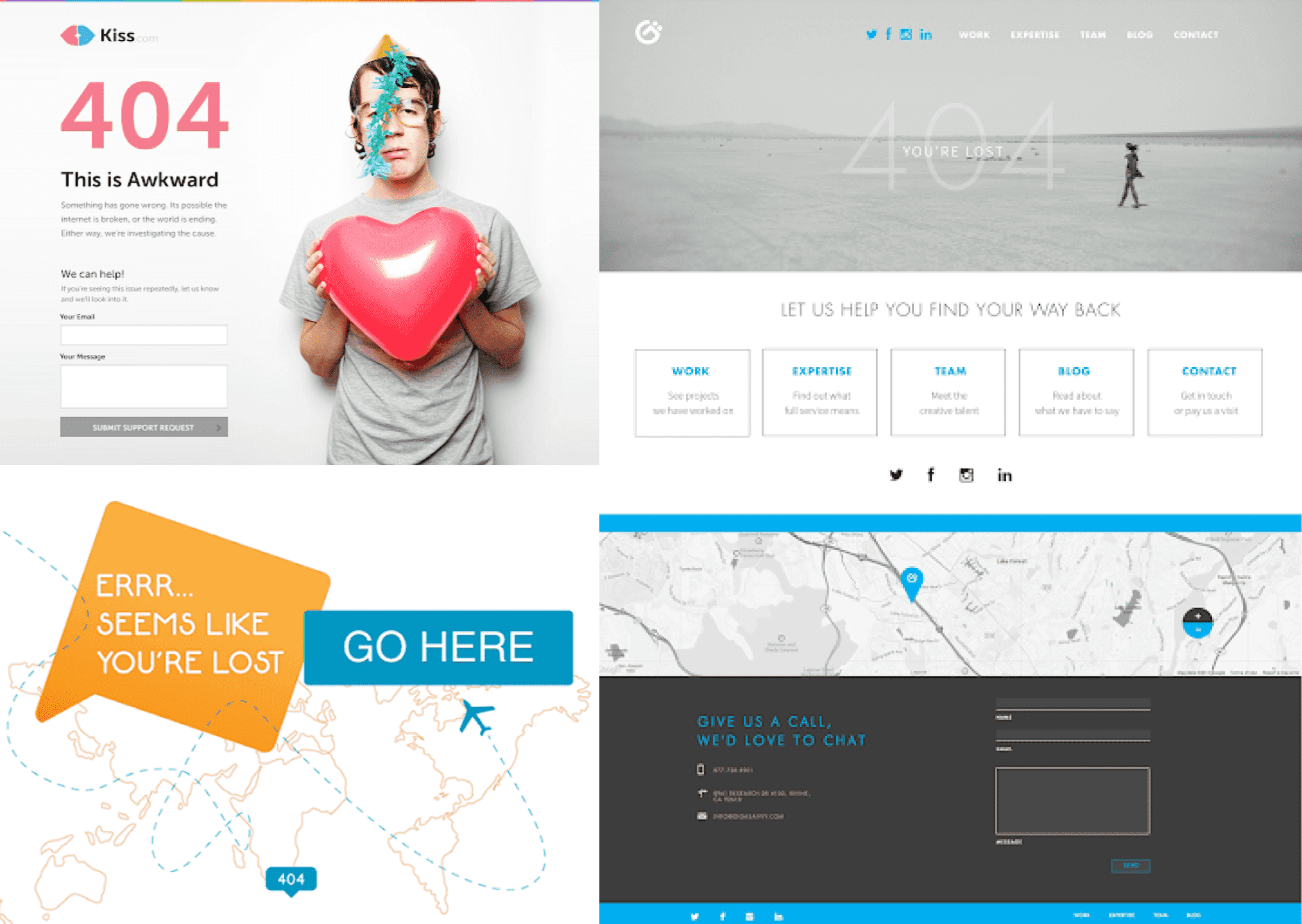
Not everything goes according to plan, and users can sometimes reach the wrong link or deleted page. A small number of users get to the 404 error page, but thoughtful design can keep your potential customers on the website. Firstly, include a contact form or website navigation so visitors can find the way out. Also, be positive and try to cheer up someone, who is already disappointed by going the wrong way.
